

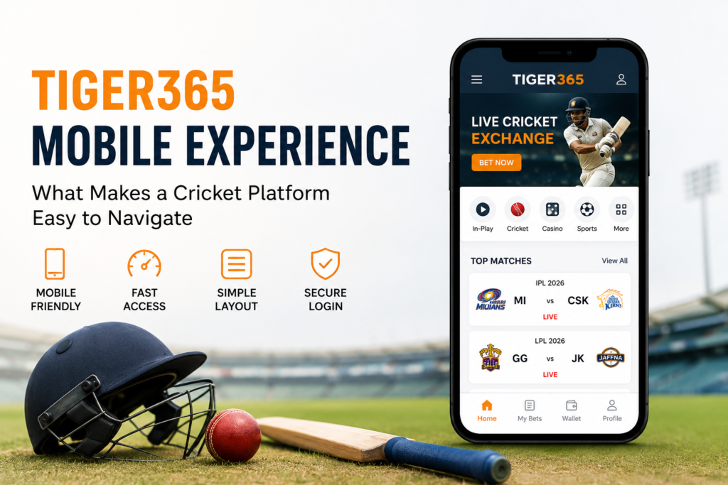
Mobile devices have changed how people follow cricket. Fans now expect match information, statistics, market details, and account controls to be easy to find without dealing with a crowded screen.
For a platform such as tiger365 mobile usability is therefore more than making a website fit a smaller display. The interface needs clear navigation, readable information, sensible menus, and controls that work well on touchscreens.
A good mobile cricket experience should help users understand where they are and what they can do next. It should not make them search through several screens just to find basic match information.
This article explains the main elements that make a cricket platform easier to navigate on mobile. It also covers practical usability checks that users can apply when evaluating a cricket exchange interface.
What Makes a Mobile Cricket Platform Easy to Navigate?
A mobile cricket platform is easier to navigate when its important features are clearly organized and accessible with minimal effort.
The most useful characteristics include:
- Clear and simple navigation menus
- Responsive page layouts
- Readable text and market information
- Easy access to live cricket sections
- Logical grouping of match information
- Touch-friendly buttons
- Consistent page design
- Fast access to important account controls
- Minimal unnecessary pop-ups
- Clear visual hierarchy
The goal is not to put every feature on the first screen. Good navigation prioritizes the information users are most likely to need.
Tiger365 Mobile Experience Why Navigation Matters
A mobile interface has less screen space than a desktop website. That limitation makes information architecture especially important.
A cricket platform may contain several types of information at once, including match schedules, teams, live scores, statistics, markets, account options, and transaction-related controls. If these elements are presented without structure, the screen can quickly become difficult to understand.
The tiger365 mobile experience should therefore be evaluated by asking a simple question:
Can a user find important information quickly without having to guess where it is?
Good navigation creates a predictable path. Users should recognize where the main cricket sections, match pages, account areas, and supporting information are located.
Responsive Design and Screen Adaptation
Responsive design allows a website to adjust its layout according to the device being used.
A mobile cricket page should not simply shrink a desktop version. Elements need to be rearranged so they remain readable and usable on smaller screens.
For example, a desktop interface might display several columns of information. On mobile, those columns may need to become vertically organized sections.
Useful responsive design characteristics include:
- Text that remains readable without excessive zooming
- Images that fit the available screen width
- Buttons with sufficient touch space
- Tables that do not force awkward horizontal scrolling
- Menus that remain accessible
- Content that maintains a logical reading order
A responsive interface reduces unnecessary movement around the page and makes the overall experience easier to understand.
Clear Menus Reduce User Confusion
Navigation menus are one of the most important parts of a mobile cricket platform.
A menu should help users understand the site’s main sections without presenting an overwhelming number of choices.
A simple structure might separate areas such as:
| Section | Purpose |
| Cricket | Cricket-related content and matches |
| Live | Current match information |
| Sports | Other available sports sections |
| Account | User account controls |
| Help | Support and general information |
The exact structure can vary, but the principle remains the same: related information should be grouped together.
Menus also benefit from familiar labels. A user should not have to interpret unusual terminology just to understand what a button does.
Finding Live Cricket Information on Mobile
Live cricket information can contain many details. Depending on the platform, users may want to see scores, teams, innings information, statistics, match status, or market data.
On a small screen, displaying everything at once can create visual clutter.
A better approach is to establish a clear hierarchy.
For example:
- Match identification
- Current match status
- Important score information
- Key statistics
- Additional match details
- Supporting market information
This structure allows users to understand the main situation before looking at secondary information.
The same principle applies to cricket exchange interfaces. Important information should be visually distinguishable from supporting details.
Readability Is Part of Mobile Usability
Navigation is not only about menus. It also depends on how easily users can read the information displayed on a screen.
Small fonts, poor spacing, crowded tables, and low visual contrast can make a mobile cricket page difficult to use.
A readable interface generally benefits from:
- Short information blocks
- Adequate spacing
- Clear headings
- Consistent typography
- Simple labels
- Logical grouping
- Easy-to-identify buttons
Users should not need to zoom repeatedly to understand match details.
Avoiding Information Overload
Cricket generates a large amount of data. A mobile platform therefore needs to distinguish between information that is immediately useful and information that can remain secondary.
For example, a live match page might highlight the current score and match status while keeping detailed statistics in expandable sections.
This approach gives users control over how much information they want to see.
Touch-Friendly Controls Matter
Desktop websites are designed around mouse clicks. Mobile interfaces depend on touch.
That difference affects button size, spacing, menus, dropdowns, and interactive elements.
A touch-friendly cricket platform should avoid placing several small controls too close together. Users should be able to select an option without accidentally tapping something nearby.
Buttons should also have understandable labels. An icon can be useful, but unfamiliar icons may create confusion when there is no supporting text.
Consistency Makes Navigation Easier
Consistency helps users learn an interface.
If the same navigation bar, icons, colors, and page structure are used throughout a platform, users do not have to relearn the interface each time they move to another section.
For example, if the account menu appears in one location on the homepage, moving it to a different location on another page can create unnecessary friction.
A consistent structure can make a platform feel more predictable even when it contains many different sections.
How Tigerexch365 Fits Into the Mobile Experience
The phrase tigerexch365 can naturally be understood in the context of the broader Tiger-related cricket exchange search ecosystem. However, users should not assume that similar brand names automatically represent the same website or service.
When evaluating any cricket platform, users should check the exact website address and understand which service they are accessing.
This is particularly useful when several brand variations appear in search results. Similar names can create confusion if users do not verify the source before interacting with a website.
What About Tigerexchange 365?
The same principle applies to searches involving tigerexchange 365.
Brand variations may appear across websites, social profiles, directories, or other online sources. A similar keyword does not by itself establish that two websites are officially connected.
For users, the practical approach is simple:
- Check the exact domain.
- Review the site’s available information.
- Avoid assuming that similar names mean identical services.
- Look for clear contact and support information.
- Review the platform’s terms before using its features.
This is a useful part of digital awareness, especially when searching for cricket-related platforms online.
A Simple Mobile Usability Checklist
Before using any cricket platform on a smartphone, users can perform a quick usability check.
1. Check the Homepage
Can you immediately identify the main cricket section?
If the homepage contains too many unrelated elements, navigation may become difficult.
2. Find a Match
Try locating a particular cricket match or competition.
Notice how many taps are required and whether the available categories make sense.
3. Open the Match Page
Check whether the match page clearly identifies the teams, match status, and important information.
4. Test the Menu
Open the navigation menu and see whether its categories are understandable.
5. Check Text Size
Read several sections without zooming.
If the text is consistently too small, the mobile layout may need improvement.
6. Test Touch Controls
Tap buttons, menus, tabs, and dropdowns.
Controls should be sufficiently separated to reduce accidental selections.
7. Review Account Areas
Account settings and transaction-related information should be clearly separated from general cricket content.
This helps users understand where they are performing different types of actions.
Common Mobile Navigation Mistakes
Even a feature-rich cricket platform can become difficult to use if its interface has basic design problems.
Too Many Menu Options
A menu containing every available feature can overwhelm users. Grouping related options into clear categories is usually easier.
Crowded Match Pages
Displaying every statistic, market, and control simultaneously can make the main information difficult to identify.
Inconsistent Navigation
Changing menu positions between pages can make users spend more time searching.
Unclear Icons
Icons without familiar meanings may force users to guess their purpose.
Excessive Pop-Ups
Repeated interruptions can make navigation frustrating, especially on smaller screens.
Poor Error Messages
If an action fails, the platform should explain what happened in plain language.
A message such as “Something went wrong” provides little practical help. A useful message should tell the user what happened and, when appropriate, what they can do next.
Mobile Experience and Responsible Use
A well-designed interface should make information easier to understand, not encourage impulsive decisions.
This matters particularly for cricket exchange and betting-related services.
Users should understand the difference between viewing cricket information and making financial decisions. Exchange activity involves financial risk, and no interface can remove that risk.
Responsible gaming practices include setting personal limits, avoiding decisions based on emotion, and not treating cricket markets as a guaranteed way to make money.
Users should also check the legal and regulatory requirements that apply to them before using any betting or exchange service.
How to Evaluate a Cricket Platform Before Using It
A useful evaluation should look beyond appearance.
Consider these areas:
| Area | What to Check |
| Navigation | Are important sections easy to find? |
| Readability | Can information be understood without zooming? |
| Match information | Is the key information clearly prioritized? |
| Touch controls | Are buttons easy to tap accurately? |
| Performance | Does the site respond reliably on your connection? |
| Account controls | Are account options clearly organized? |
| Transparency | Are terms, policies, and support information available? |
| Mobile layout | Does the design work properly across different screen sizes? |
This approach gives users a more realistic picture of usability than simply judging a website by its visual appearance.
Key Takeaways
- Mobile cricket platforms need simple and predictable navigation.
- Responsive design should adapt content instead of merely shrinking desktop pages.
- Live match information should have a clear visual hierarchy.
- Readable text and touch-friendly controls are essential on smartphones.
- Consistent menus help users move between different sections.
- Similar brand keywords should not automatically be treated as the same service.
- Users should check domains, policies, support information, and applicable rules.
- Good interface design improves usability but does not remove financial risk.
Conclusion
A useful mobile cricket platform is built around clarity. Users should be able to locate cricket information, understand what they are viewing, and move between sections without unnecessary confusion.
The tiger365 mobile experience can be assessed through the same practical standards: responsive design, clear menus, readable information, logical match pages, consistent controls, and transparent account features.
For anyone researching cricket exchange platforms in India, these usability factors are worth considering before focusing on individual features. A clean interface cannot guarantee a particular outcome, but it can make information easier to understand and help users make more informed choices.
FAQs
What makes a cricket platform easy to navigate on mobile?
Clear menus, readable text, responsive layouts, logical match pages, and touch-friendly controls are key factors. Users should be able to reach important cricket information without unnecessary steps.
Why is responsive design important for cricket platforms?
Responsive design allows a platform to adapt to different screen sizes. It helps prevent tiny text, broken layouts, excessive scrolling, and difficult-to-use controls on smartphones.
What should a mobile cricket match page show first?
The match identity, teams, current status, and key score information should generally receive priority. Secondary statistics and additional information can follow.
Is a similar brand name proof that two cricket platforms are connected?
No. Similar names such as Tiger365, tigerexch365, and tigerexchange 365 do not automatically prove that websites or services are affiliated. Users should verify the exact domain and available official information.
How can I test a cricket platform’s mobile usability?
Open the website on your phone, find a cricket match, open its match page, test the navigation menu, read the displayed information, and try the main touch controls.
Why can too much information hurt mobile usability?
Smartphone screens have limited space. Showing too many statistics, buttons, and market details at once can make important information harder to identify.
What should users check besides mobile design?
Users should also review terms, privacy information, support options, account controls, and any applicable legal or regulatory requirements before using a service.
Does good mobile navigation eliminate betting risk?
No. Interface quality only affects usability. It cannot remove the financial risks associated with betting or exchange activity.